
Dashboards
An AI Analytics dashboard is a named collection of charts pinned from Collate AI conversations. Charts from any conversation can go into the same dashboard, and you can build it up over time. Once a dashboard has charts, you can schedule it to refresh automatically, control who can open it, and deliver snapshots to your team. This page covers creating and managing dashboards and working with charts.Create a Dashboard
-
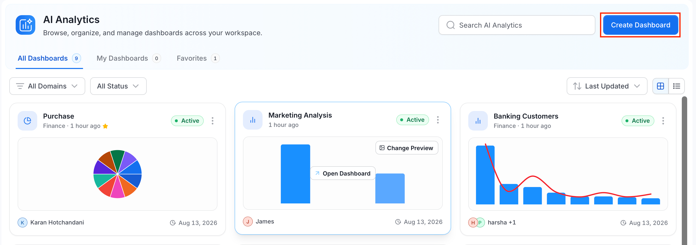
In the left navigation menu, select AI Analytics and then click Create Dashboard.
-
On the Create New Dashboard dialog, enter the following details:
- Dashboard Name (required)
- Owners: defaults to you. Search to add other users or teams, or remove yourself.
- Domain: optionally assign a business domain at creation time.
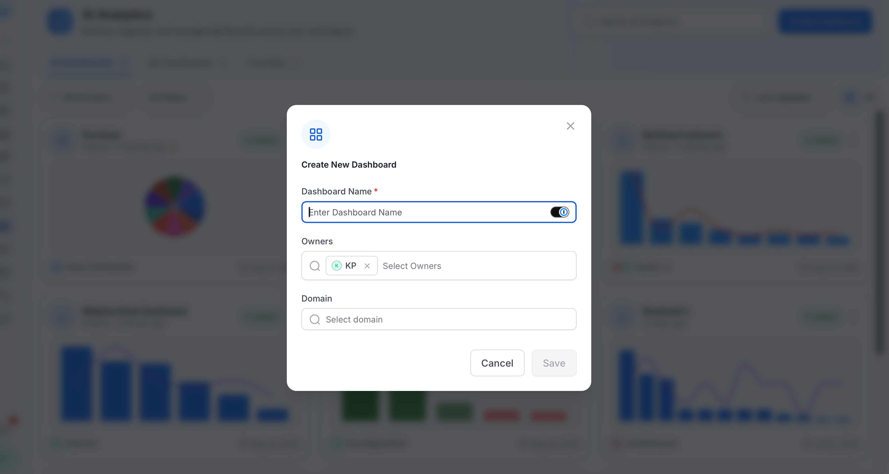
- Click Save. The dashboard is created with Private visibility and you are taken to the detail page.
Chart Provenance
Every chart in an AI Analytics dashboard carries a Built with AI · N prompts badge. Clicking it opens the Collate AI conversation that produced the chart — including the questions asked, the SQL that ran, and the AI’s reasoning steps. You are never left with a number you can’t trace. Dashboard owners can toggle the visibility of each conversation independently:- Shared with dashboard viewers (toggle on) — anyone with access to the dashboard can open that conversation and see the questions, SQL, and reasoning behind the chart. The badge on the chart shows the eye icon.
- Private to owners (toggle off) — the conversation is hidden from viewers. On the chart badge, viewers see “Conversation private” instead of the prompt count. Owners always see the full detail.
Adding Your First Chart
A Draft dashboard shows a Let’s build your dashboard screen with a single conversational input: “Describe the chart you want and Collate builds it from your data—or bring in a chart that’s already published.”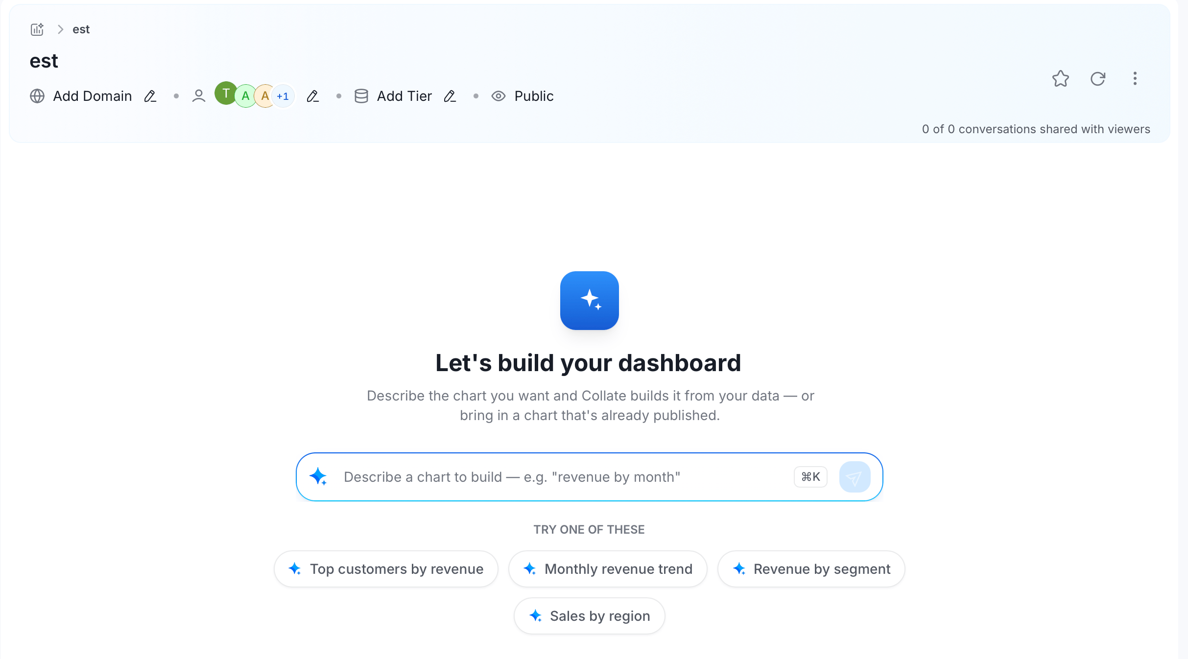
- Type what you want to see in plain language (for example, “revenue by month”), or click one of the suggested starters: Top customers by revenue, Monthly revenue trend, Revenue by segment, or Sales by region.
- Press Enter, or click the send button, to submit.
- Collate AI builds the chart, reusing an existing published chart if one already answers your request, or generating a new one, and adds it to the dashboard, which then becomes Active. Reusing a chart from elsewhere pins an independent copy to this dashboard. Editing it doesn’t affect the original.
Dashboard Detail Page
Opening a dashboard takes you to its detail page, where you manage its charts, schedule, and access.Header
The dashboard detail header contains: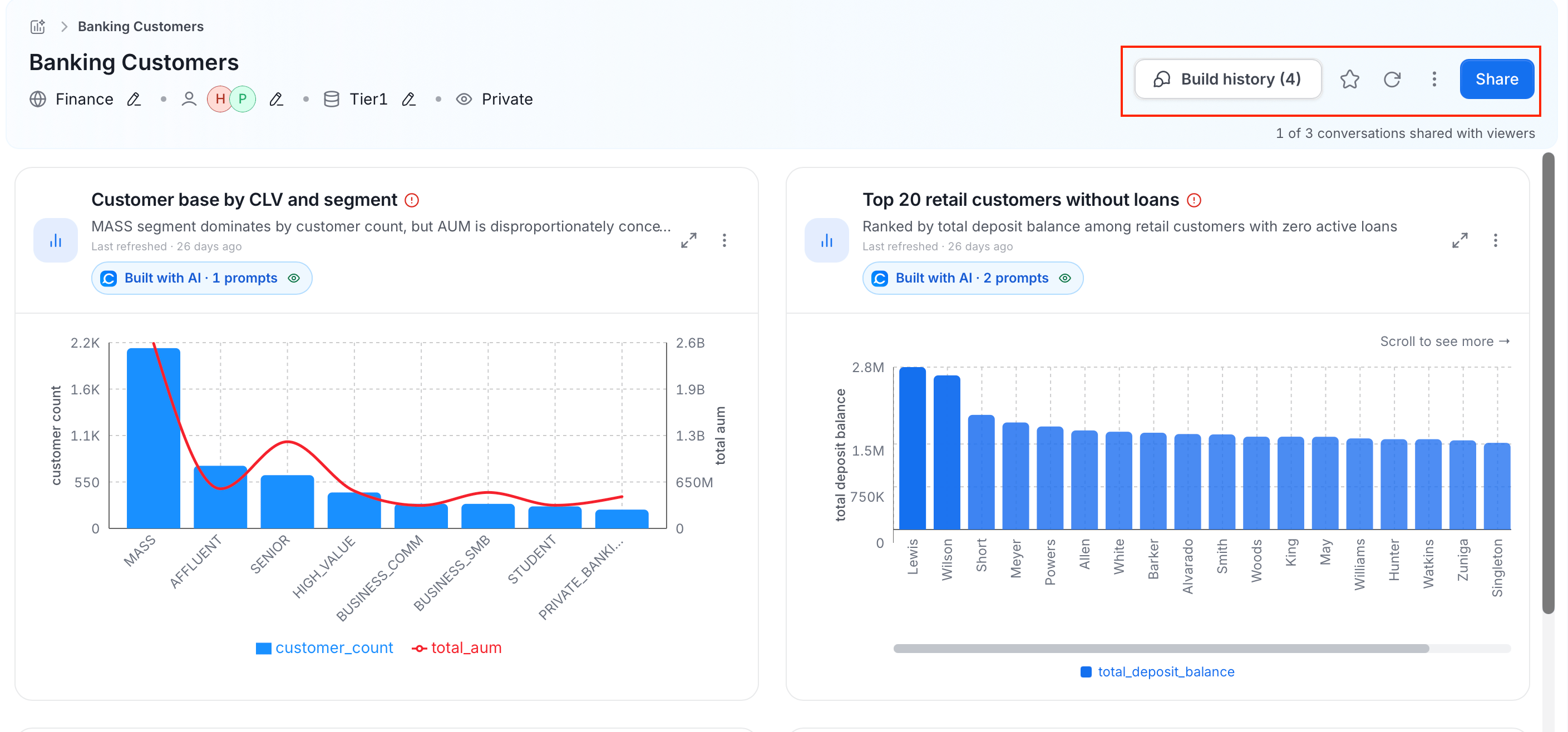
Who can see the dashboard at all is controlled separately, next to its Domain and Owners — see Visibility.
Access Control
Dashboards have three visibility levels — Private, Shared, and Public — that control who can open the dashboard. The default when you create a dashboard is Private (owners only). Click the current visibility label in the dashboard header to change it. Viewer access to the underlying data still respects each person’s existing Collate permissions, regardless of visibility level. For full details on setting visibility, adding specific users or teams, and configuring notifications, see Schedule & Share.Manage Dashboard
Click the ⋮ icon to open the following options: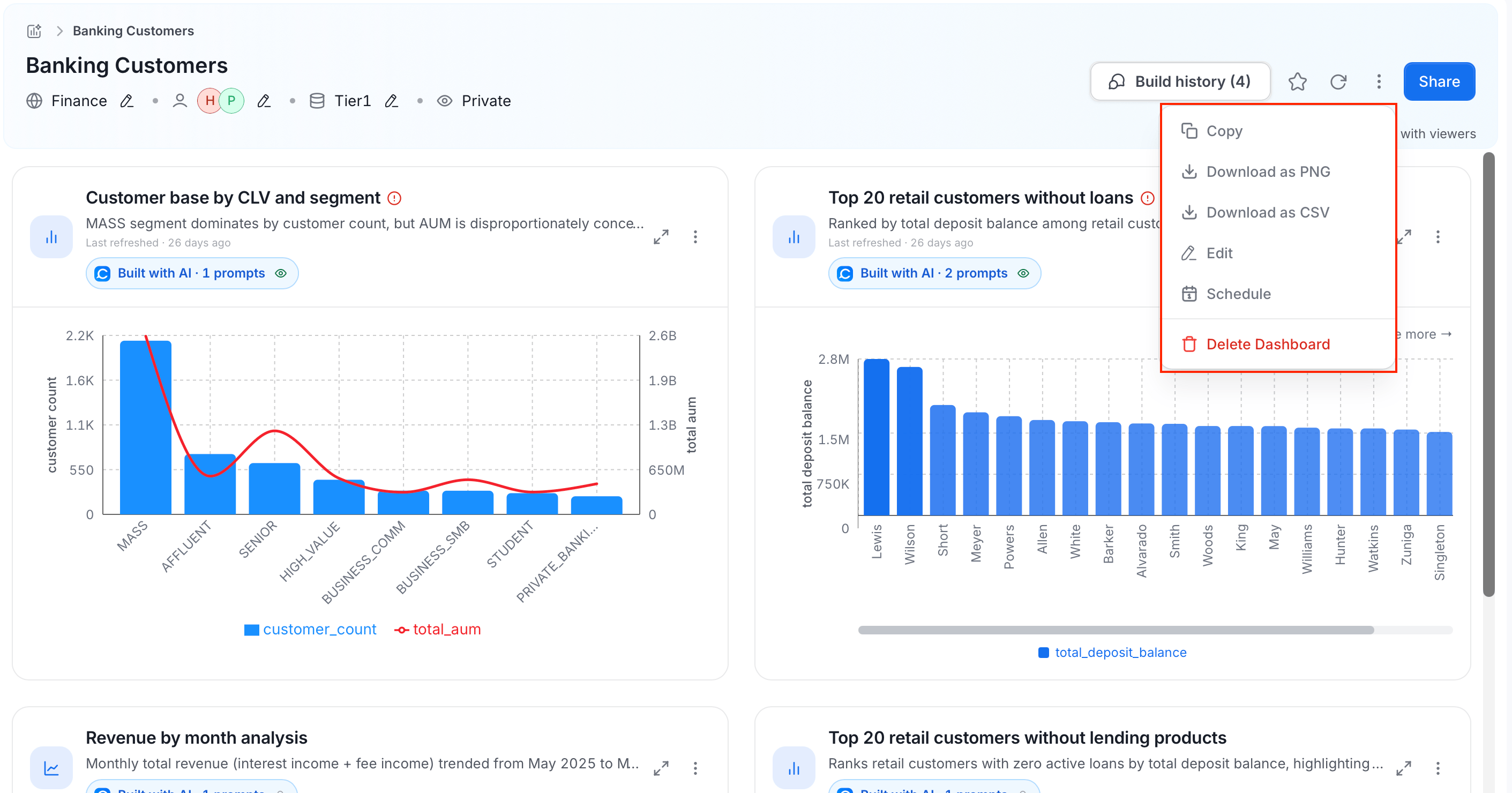
Dashboard Information
Below the title, view and update the dashboard’s key details:- Domain: the business domain this dashboard belongs to
- Owners: users or teams responsible for this dashboard
- Tier: click Add Tier to select a governance tier from the list. Once selected, the button updates to show the chosen tier name.
Charts
Charts render as a card grid. Each chart card shows:- The chart title and a brief AI-generated summary (description).
- A Built with AI · N prompts badge indicating how many Collate AI conversation turns produced this chart — click the badge to view the conversation.
- Per-chart actions: refresh, edit, expand to full screen, delete.
Add Another Chart
At the bottom of the chart grid, a dashed Add another chart placeholder lets you extend the dashboard at any time. Clicking it opens the Add a chart dialog, where you describe the chart in plain language (for example, “revenue by month”) or pick from suggested starters:- Top customers by revenue
- Monthly revenue trend
- Revenue by segment
- Sales by region
Build History
The Build History panel shows every Collate AI conversation that contributed a chart to this dashboard.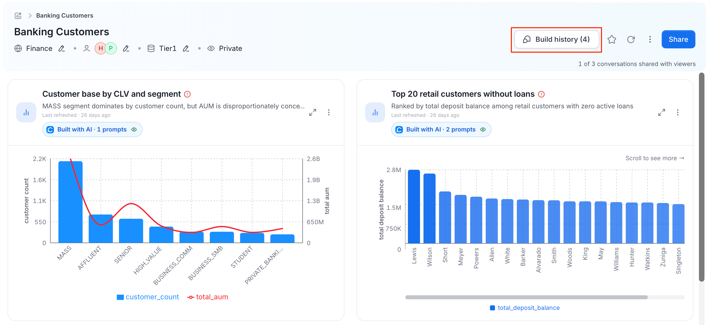
- Who can see it: by default, only owners can view build history. Owners can choose to share individual conversations with dashboard viewers.
-
Per-conversation sharing toggle: each conversation has a toggle:
- Shared with dashboard viewers: anyone with access to the dashboard can read this conversation
- Private to owners: only owners can see this conversation
-
Continue the conversation: a text input at the bottom of the panel lets owners resume any conversation and refine or extend a chart without leaving the dashboard.

AI Charts
AI Charts are the individual visualizations generated from Collate AI chat conversations and pinned to dashboards. Each chart belongs to exactly one dashboard. If you pin the same chart to a second dashboard, Collate creates an independent copy there: the copy keeps the original’s title, owners, and query, but starts its own version history from that point forward. Every chart requires a query type, which tells Collate how to execute the underlying data retrieval:sql— the chart runs a SQL query against a connected data warehouse.dataInsight— the chart queries Collate’s internal Data Insights layer (metadata-driven KPIs and activity metrics).
Chart Types
AI Analytics supports the following visualization types:Display Options
All chart types support:- Color scheme: one or more hex colors; one color per series or per group value
- Axis titles: custom labels for the X and Y axes
- Axis scale: Linear or Logarithmic
- Number format: Plain, Currency (with ISO 4217 code, for example USD), Percent, or Compact
Table Charts
Table charts additionally support:- Sort: sort by any column, ascending or descending
- Filters: per-column filters with operators: equals, not equals, contains, greater than, greater than or equal, less than, less than or equal
- Column visibility: show or hide individual columns
- Pagination: configurable page size
Best Practices
- Pin charts as you go from Collate AI conversations rather than rebuilding from scratch — each pinned chart carries the AI’s reasoning and the conversation that produced it, so you always know where a number came from.
- Use the Build History panel to share key conversations with dashboard viewers when you want them to understand the methodology, or keep them private when the working notes are not ready to share.
- Use a dedicated service account as the refresh identity for scheduled dashboards so refreshes do not break when individual users leave or rotate credentials.