Profiler Tab
The Data Observability tab is displayed only for Tables. It has three sub-tabs for Table Profile, Column Profile, and Data Quality.Table Profile Tab
The Table Profile tab displays structural metrics and timeseries charts for a table, giving a clear picture of how data volume and composition change over time.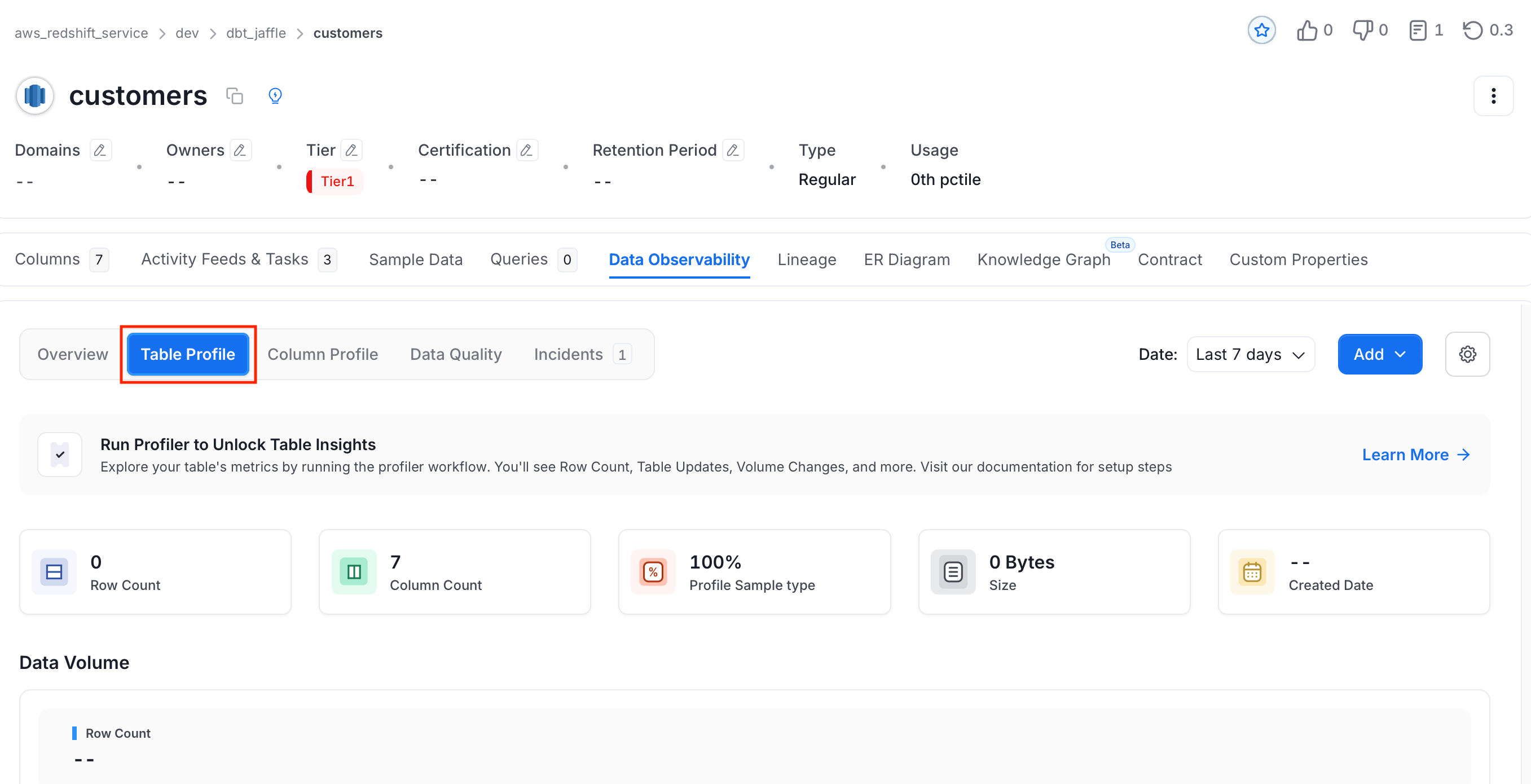
- Row Count: The total number of rows in the table, tracked over the selected date range.
- Column Count: The total number of columns in the table.
- Profile Sample Type: The portion of data profiled, shown as a percentage or an absolute row count.
- Size: The total size of the table on disk.
- Created Date: The date the table was first created.
-
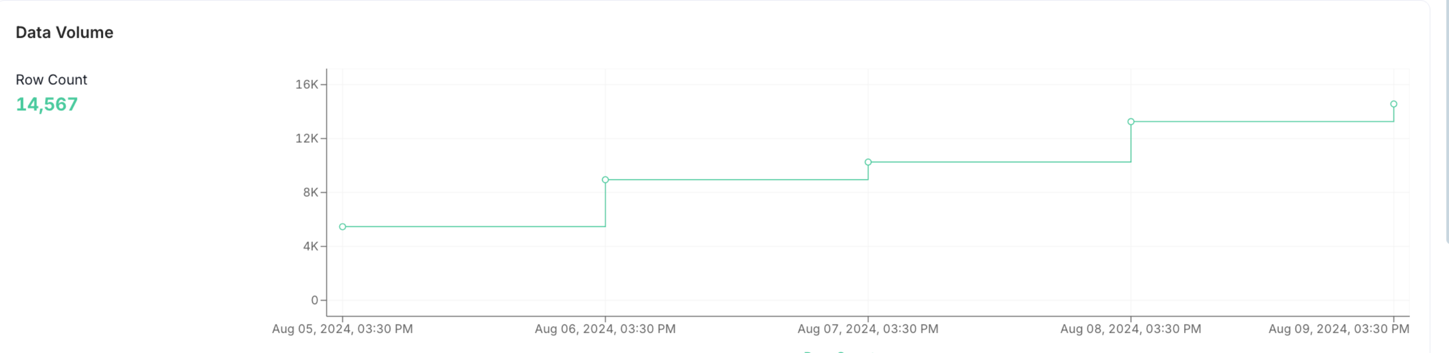
Data Volume: A timeseries chart showing how row count evolves over the selected time period.
-
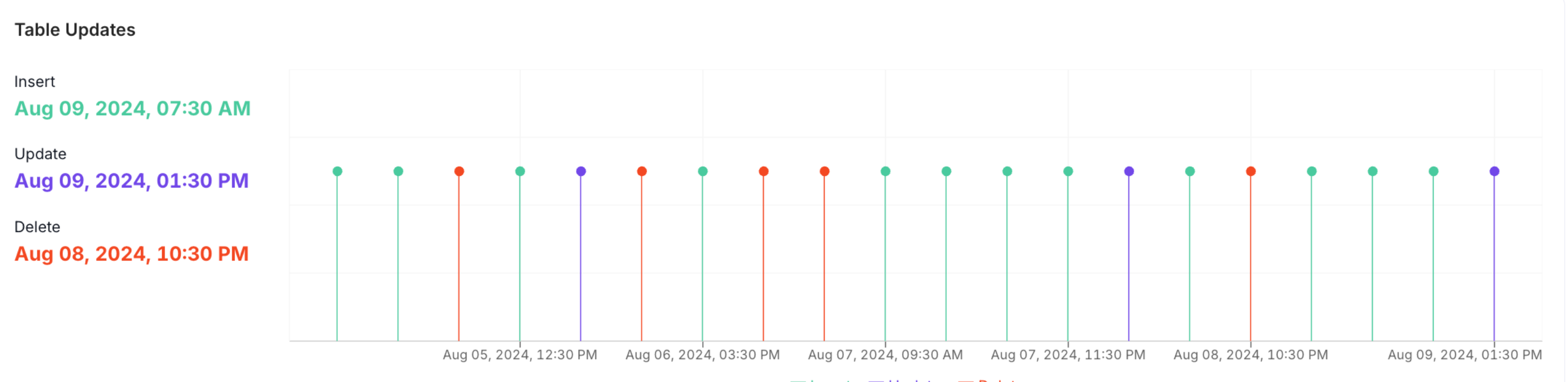
Table Updates: A timeseries chart showing the number of inserts, updates, and deletes that occurred in the table over time.
-
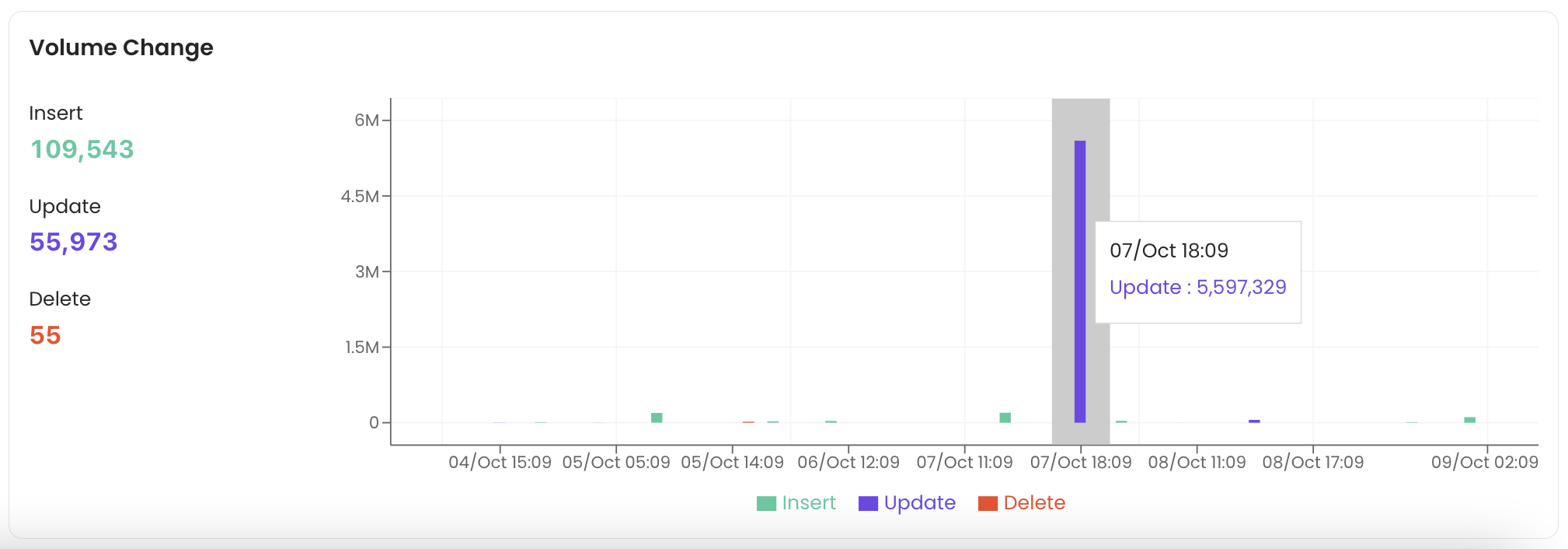
Volume Change: A timeseries chart showing the volume of data affected by inserts, updates, and deletes over the selected period.
Column Profile Tab
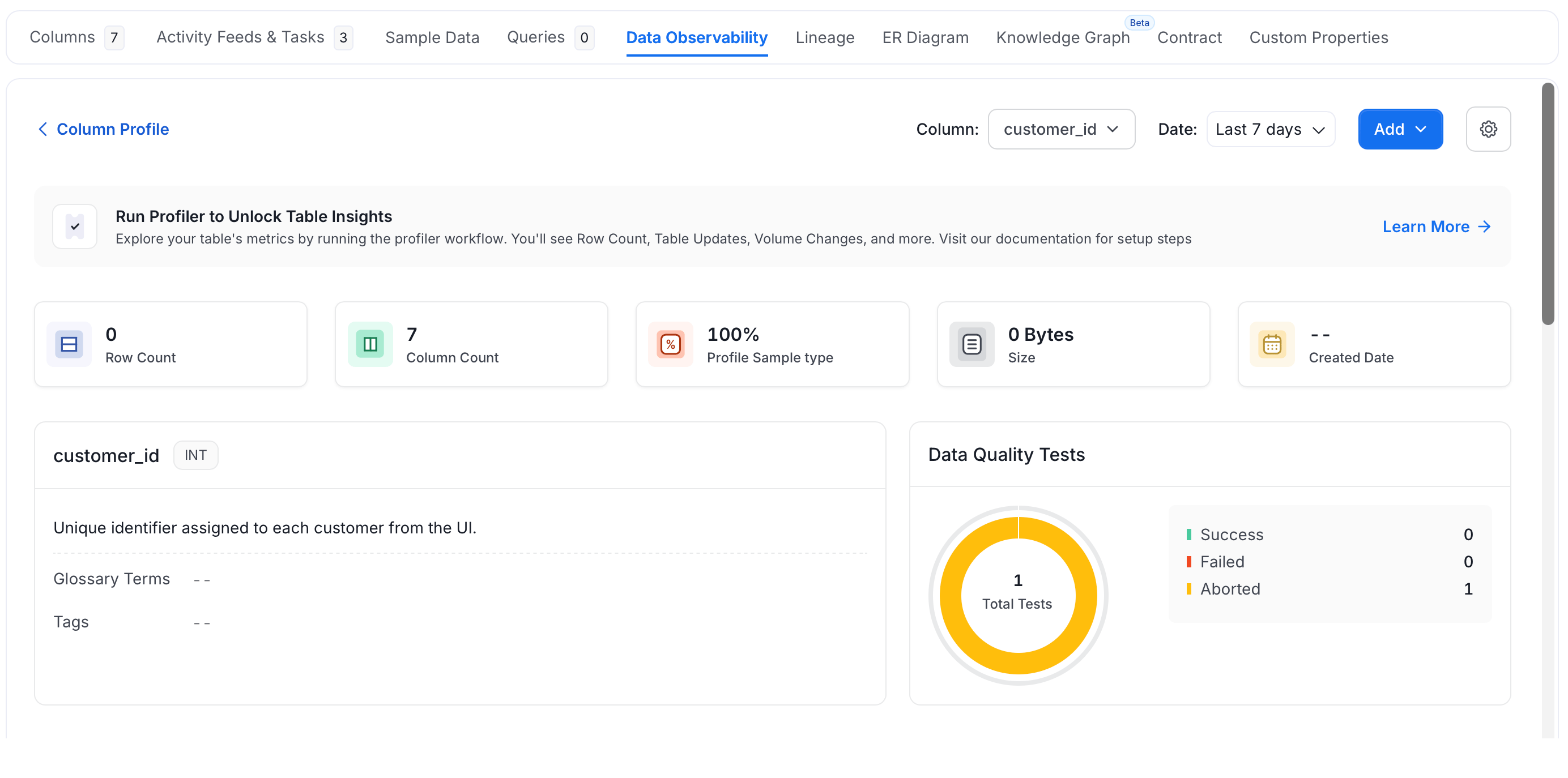
The Column Profile tab shows profiling metrics for every column in a table, making it easy to spot data quality issues at the column level.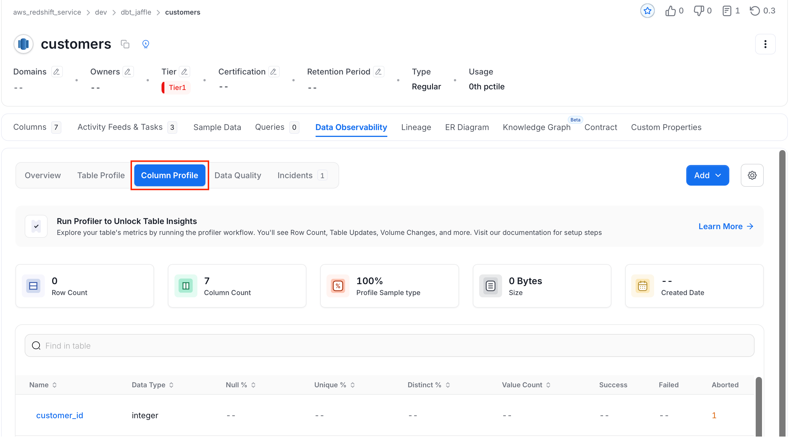
- Name: The unique identifier for the column within the table.
- Data Type: The kind of data stored in the column, such as integer, string, boolean, or timestamp.
- Null %: The share of rows where this column has no value.
- Unique %: The share of values that appear exactly once in the column.
- Distinct %: The share of values that are different from each other, regardless of how often they repeat.
- Value Count: The number of rows that contain a non-null value in this column.
- Success / Failed / Aborted: Results of the most recent data quality test run on this column.
-
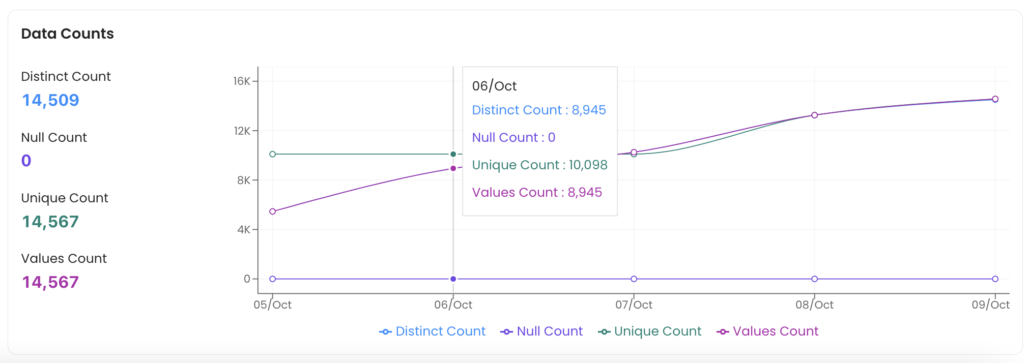
Data Counts: A chart showing the number of Distinct, Null, Unique, and total Values in the column over time.
-
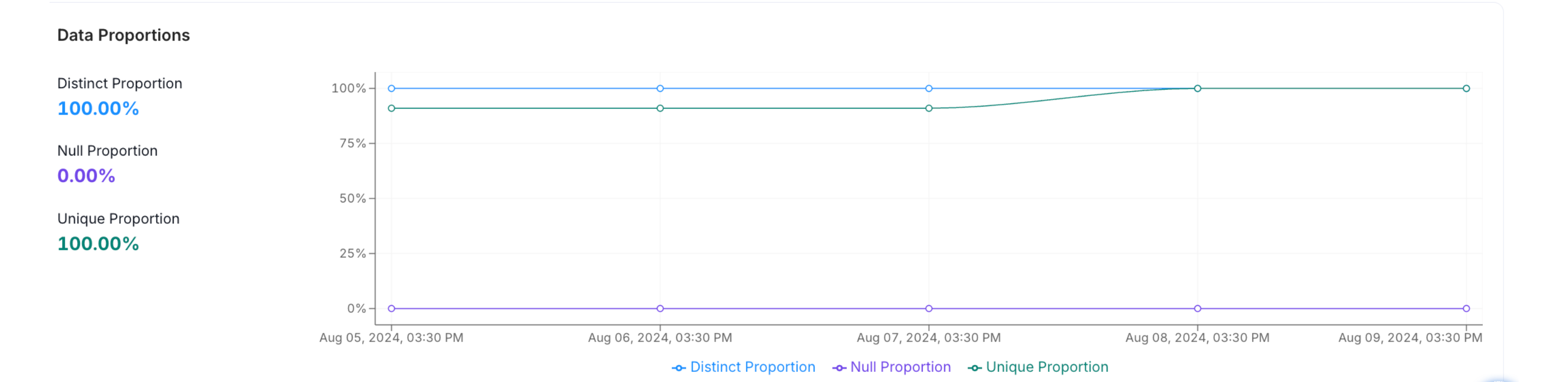
Data Proportions: A chart showing the Distinct %, Null %, and Unique % ratios in the column over time.
-
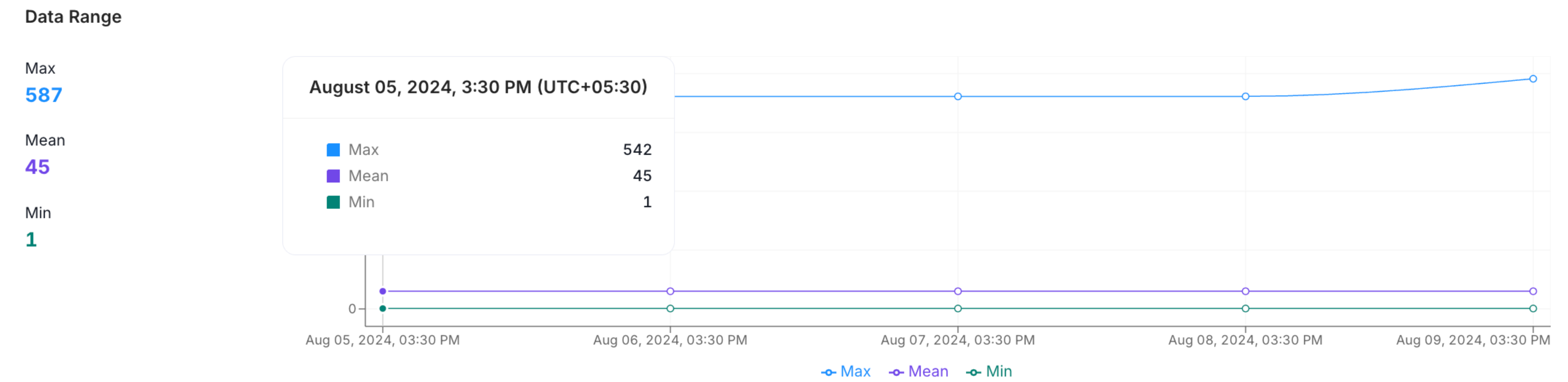
Data Range: A chart showing the Minimum, Maximum, and Mean character lengths for string columns — useful for text and NLP analysis.
-
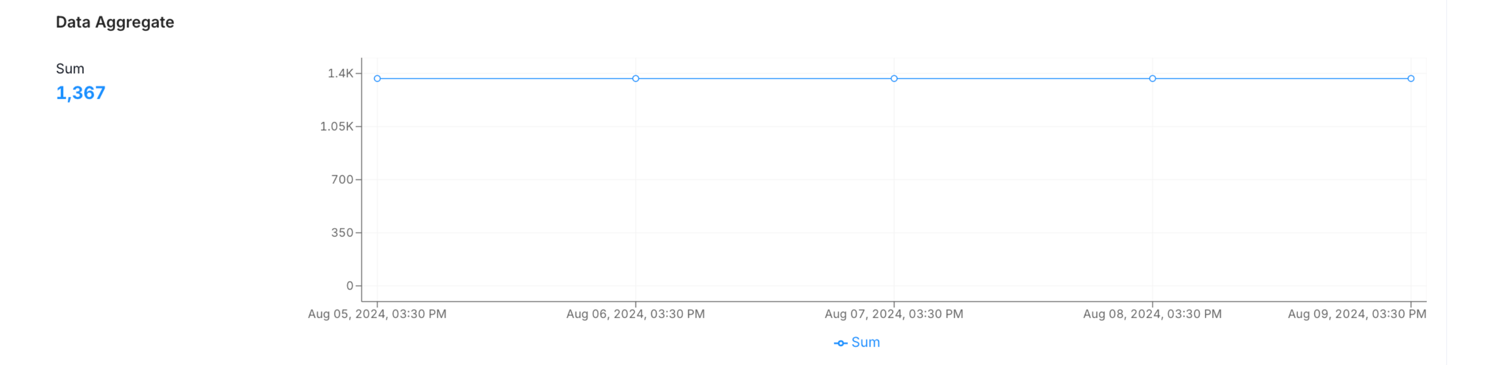
Data Aggregate: A chart showing the sum of numeric column values over time.
-
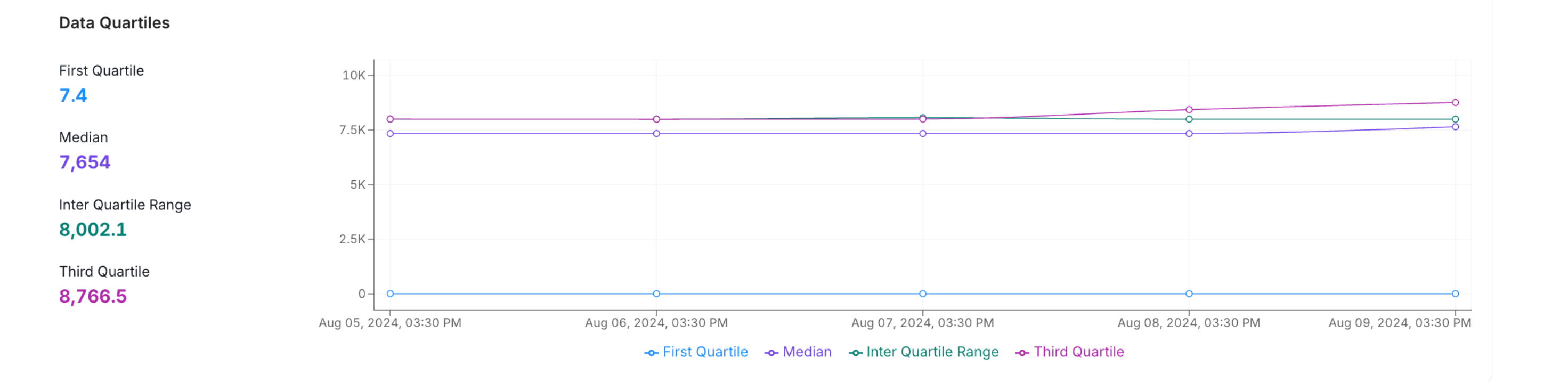
Data Quartiles: A chart showing the First Quartile, Median, Inter Quartile Range, and Third Quartile to reveal how values are spread.
-
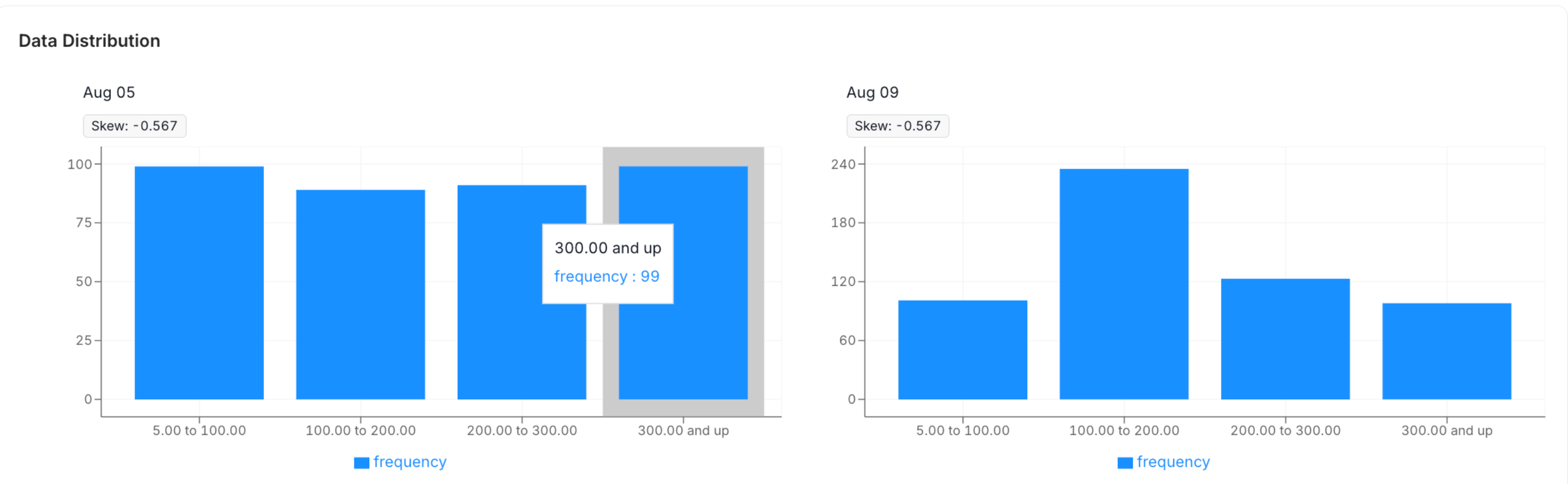
Data Distribution: A histogram showing how character lengths are distributed within the column.