
Overview
Pipeline Observability gives you one place to see whether your pipelines are running as expected. Instead of logging into Airflow, Dagster, or another orchestrator to check each pipeline separately, you can see every pipeline’s status, schedule, and run history right in Collate, along with the data assets each pipeline feeds.Accessing Pipeline Observability
From the left side navigation menu, go to Observability > Pipeline to open the pipeline dashboard.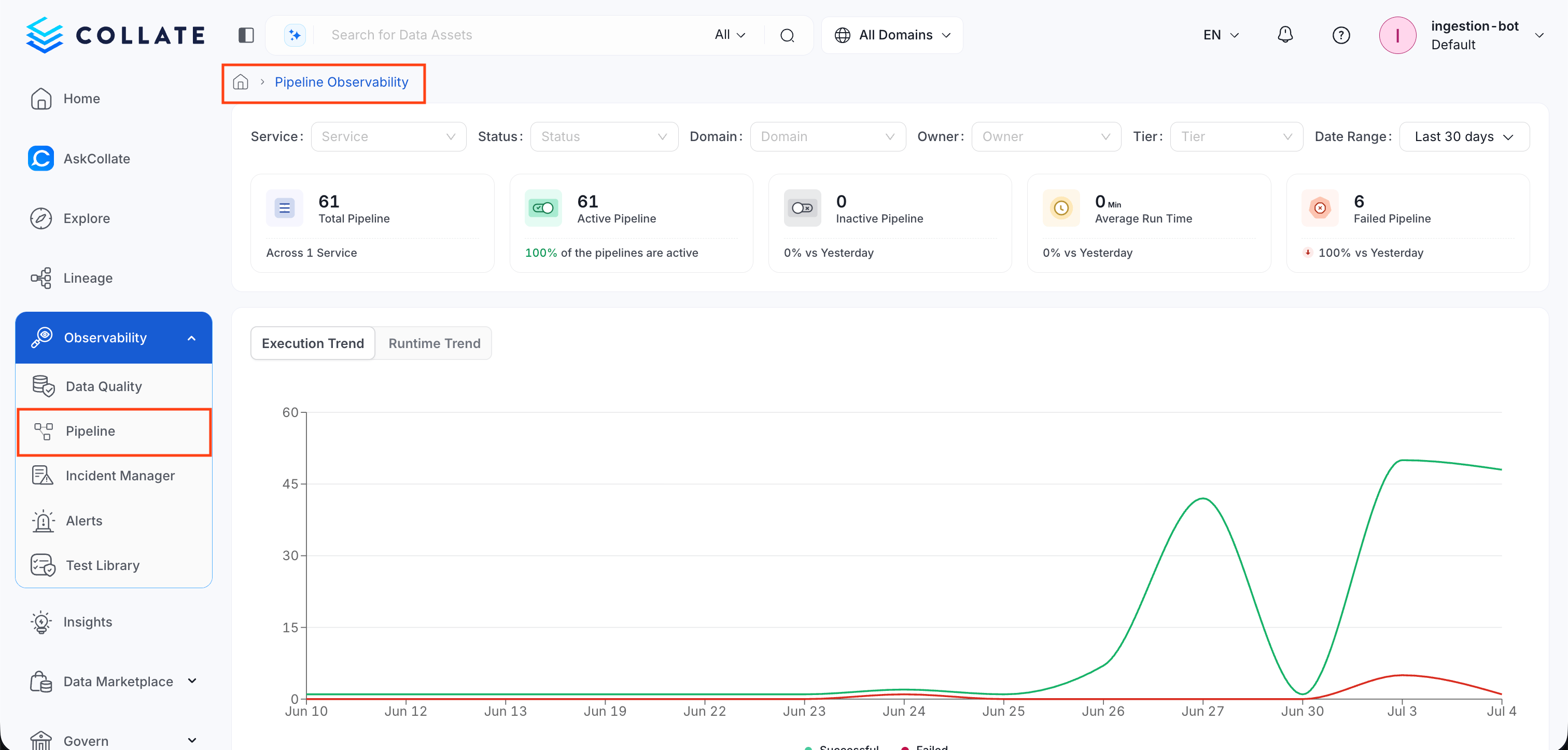
Pipeline Dashboard
The dashboard shows you every pipeline in your catalog at once, so you can spot problems without opening each pipeline individually.Filters
At the top of the page, use these filters to narrow the pipeline list down to what you care about:- Service: Show pipelines from one source only, such as Airflow, Dagster, or Fivetran.
- Status: Show pipelines by their last run status, such as Successful or Failed.
- Domain: Show pipelines that belong to a specific domain.
- Owner: Show pipelines assigned to a specific owner.
- Tier: Show pipelines at a specific tier of importance.
- Date Range: Show data for a specific time window, such as the last 30 days.
Summary Statistics
The dashboard contains the following summary cards that give you a quick health check across all your pipelines:- Total Pipeline: The total number of pipelines, and the number of services they come from.
- Active Pipeline: The total number of pipelines currently active, shown as a percentage of all your pipelines.
- Inactive Pipeline: The total number of pipelines that are inactive, with the change compared to the day before.
- Average Run Time: The average time a pipeline takes to run, with the change compared to the day before.
- Failed Pipeline: The total number of pipelines that failed on their last run, with the change compared to the day before.

Execution and Runtime Trend Charts
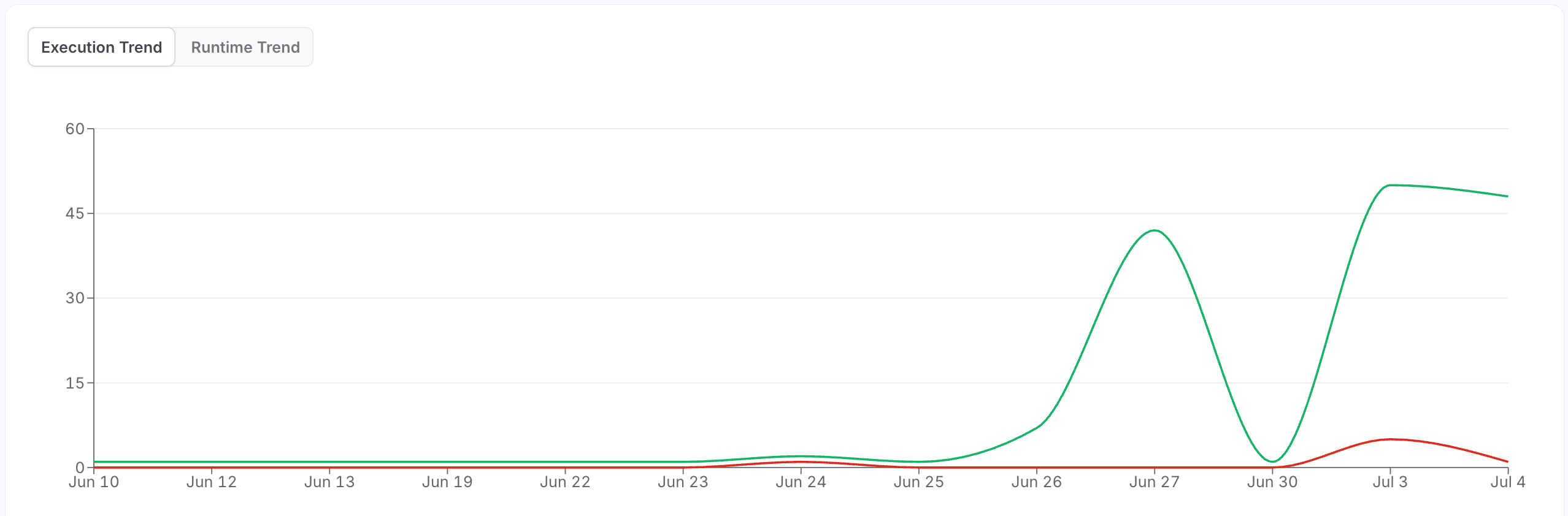
The two line charts show pipeline performance over the selected date range, with dates displayed along the bottom axis.- Execution Trend: Shows the total number of pipeline runs on each date. Use this to see how often your pipelines are running and spot any unusual spikes or drops in activity.
- Runtime Trend: Shows how long pipeline runs took to complete on each date. Use this to spot pipelines that are gradually slowing down or that had a sudden jump in runtime.
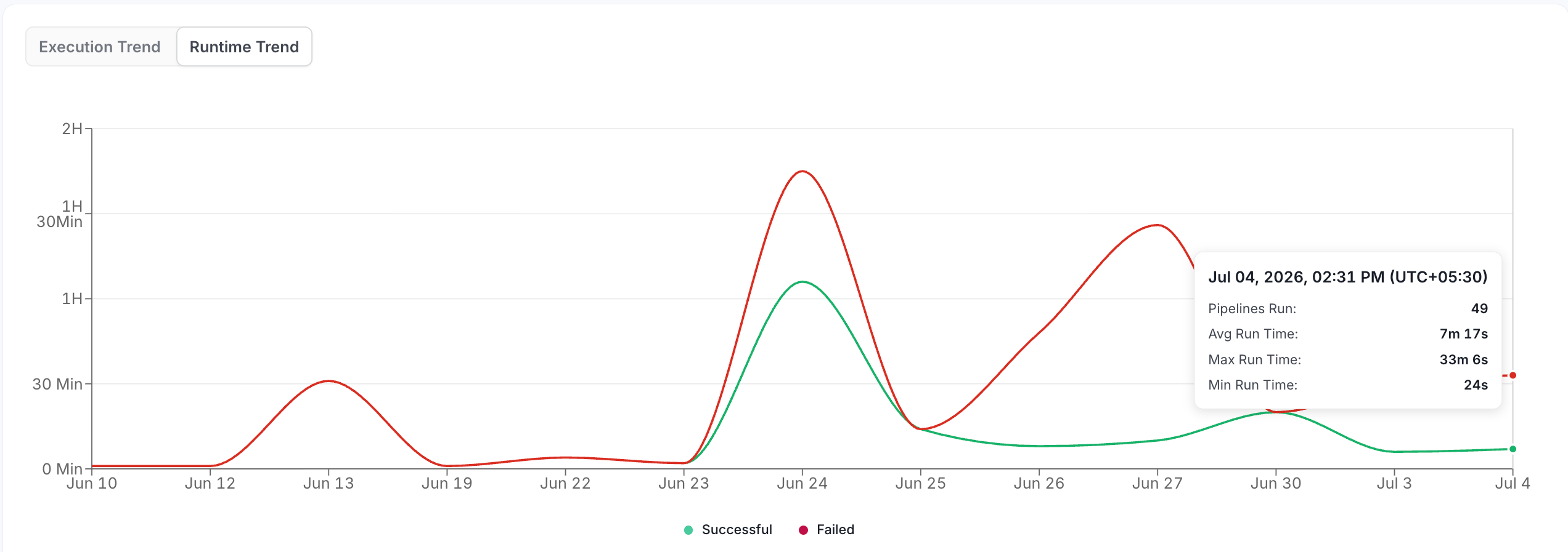
- Green line: Successful runs
- Red line: Failed runs
Pipeline Table
The Pipeline Observability Overview table gives a consolidated view of your pipeline’s health, recent executions, and performance trend, for every pipeline that matches your filters. The table contains the following columns:- Pipeline Name: The name of the pipeline. Click to open the pipeline’s details page. See Pipeline Details Page.
- Service: The name of the service the pipeline runs on.
- Last Run: The date and time of the pipeline’s most recent run.
- Last Run Status: Shows the status of most recent run - Successful or Failed.
- Schedule: The schedule at which the pipeline runs.
- Next Run: The date and time of the pipeline’s next scheduled run.
- Impacted Assets: The number of data assets that pipeline feeds. Click to view the data assets impacted by the recent run.
Pipeline Details Page
The Pipeline Details page shows a detailed summary of a single pipeline’s schedule, performance, and run history.Summary Cards
Three cards summarize the pipeline’s schedule, reliability, and most recent run:- Pipeline Schedule: Shows when the pipeline runs.
- Schedule: The schedule at which the pipeline is set to run.
- Next Run: The date and time of the pipeline’s next scheduled run.
- Pipeline Insights: Shows how reliably the pipeline has been running.
- Success rate: The percentage of runs that succeeded.
- Failure Rate: The percentage of runs that failed.
- Last Run Stats: Shows the outcome of the pipeline’s most recent run.
- Run Time: The date and time the last run started.
- Duration: How long the last run took to complete.
- Status: Whether the last run succeeded or failed.
Run History Chart
The Run History chart shows the number of successful and failed pipeline runs over the selected date range. Each line is color-coded and labeled in the legend below: green for successful runs and red for failed runs.Tabs
The tabs provide different views of the pipeline. Models shows affected data assets, Tasks shows task definitions, and Run History shows task-level execution history.- Models: A table of the data assets this pipeline produces or affects, including each asset’s last run, last run status, last updated time, and average run time. You can filter by status and search by name.
- Tasks: The individual tasks or steps inside the pipeline, viewable in two ways:
- List: Shows the tasks as a table, one row per task.
- DAG (Directed Acyclic Graph): Shows the tasks as a graph, so you can see how they connect and run in sequence.
- Run History: The pipeline’s task-level execution history. Each row represents a task execution, not a DAG run or pipeline run. Filter by status or duration, or search by task name.