Custom Data Insight Dashboards
The default Data Insight charts in Collate focus on description, ownership, and tiering. However, documentation needs often vary across organizations. To address this, Collate now supports the creation of custom Data Insight dashboards and charts. This documentation will guide you through the process of creating these custom dashboards and charts within your Collate instance, empowering you to tailor insights to your organization’s unique documentation goals for enhanced data governance.Step 1: Create a Dashboard
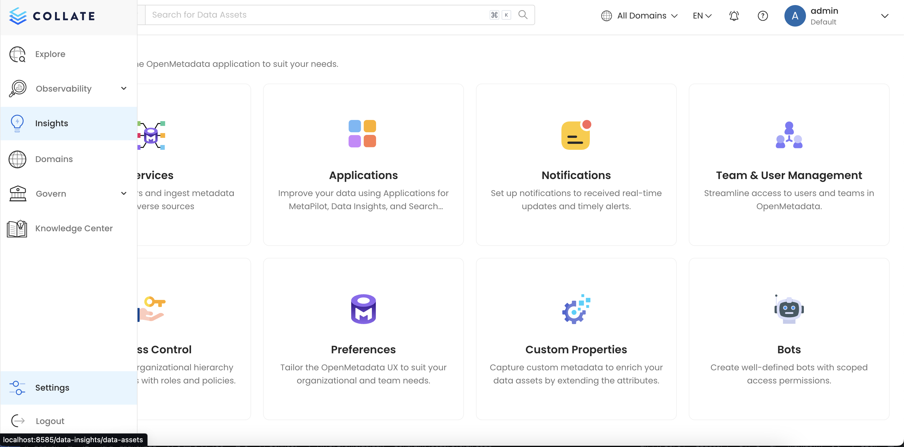
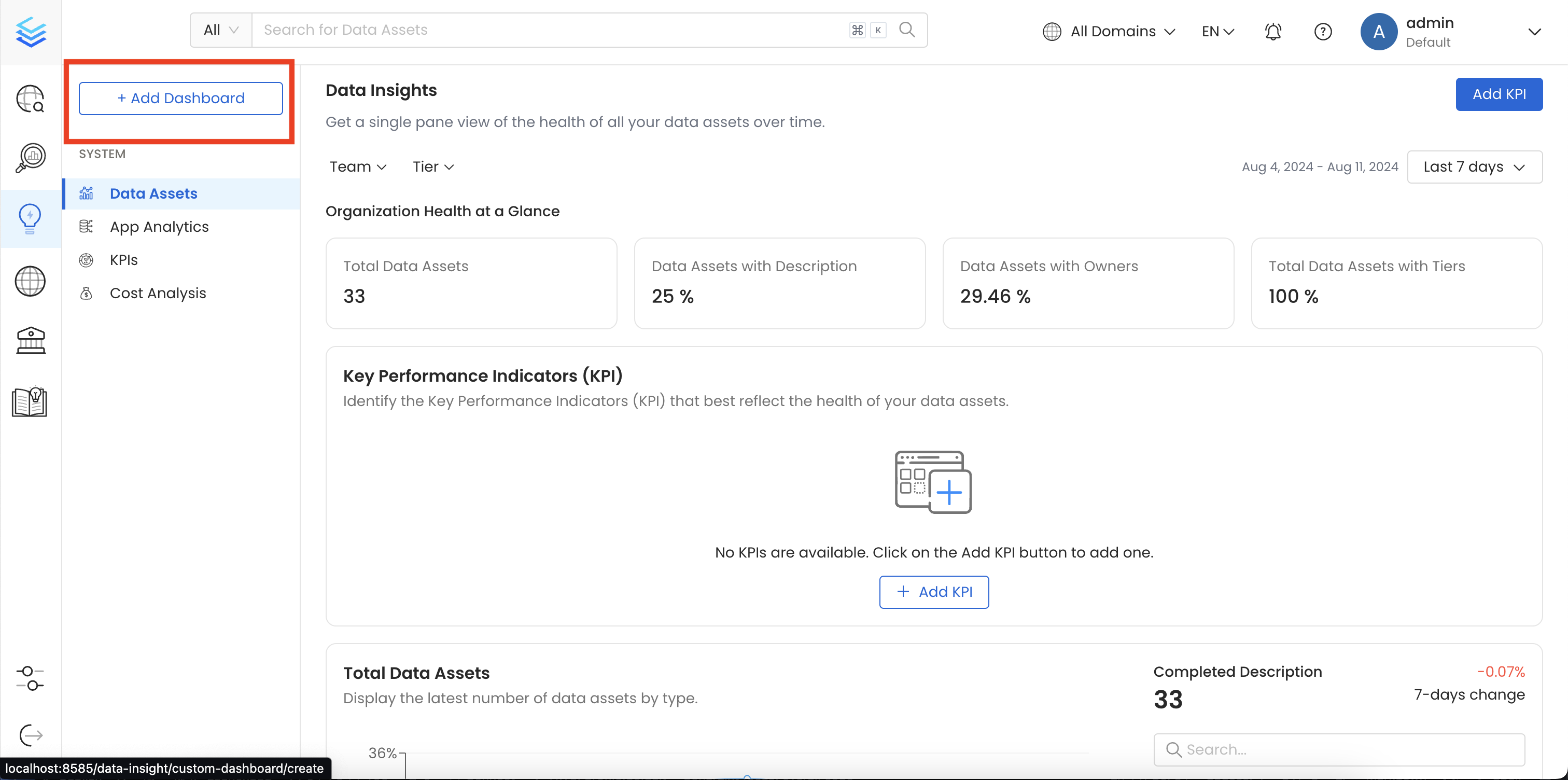
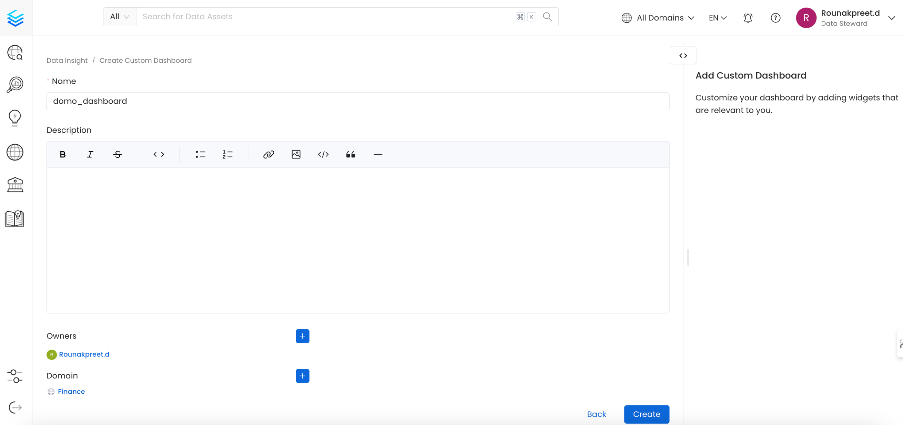
Navigate to theInsights page from the side menu of application and click on Create Dashboard button from top left, provide the name, description and owner of the dashboard and finally click on Create button to save the dashboard.
Step 2: Create a Chart
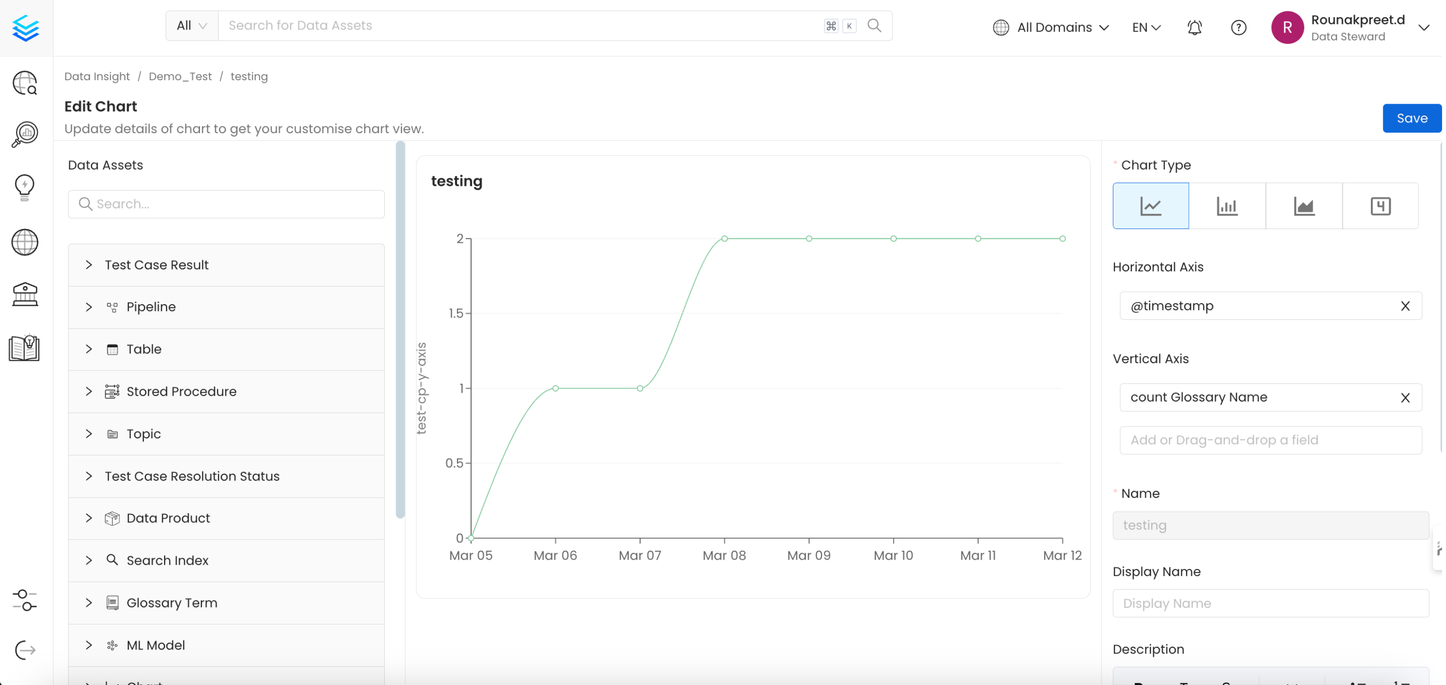
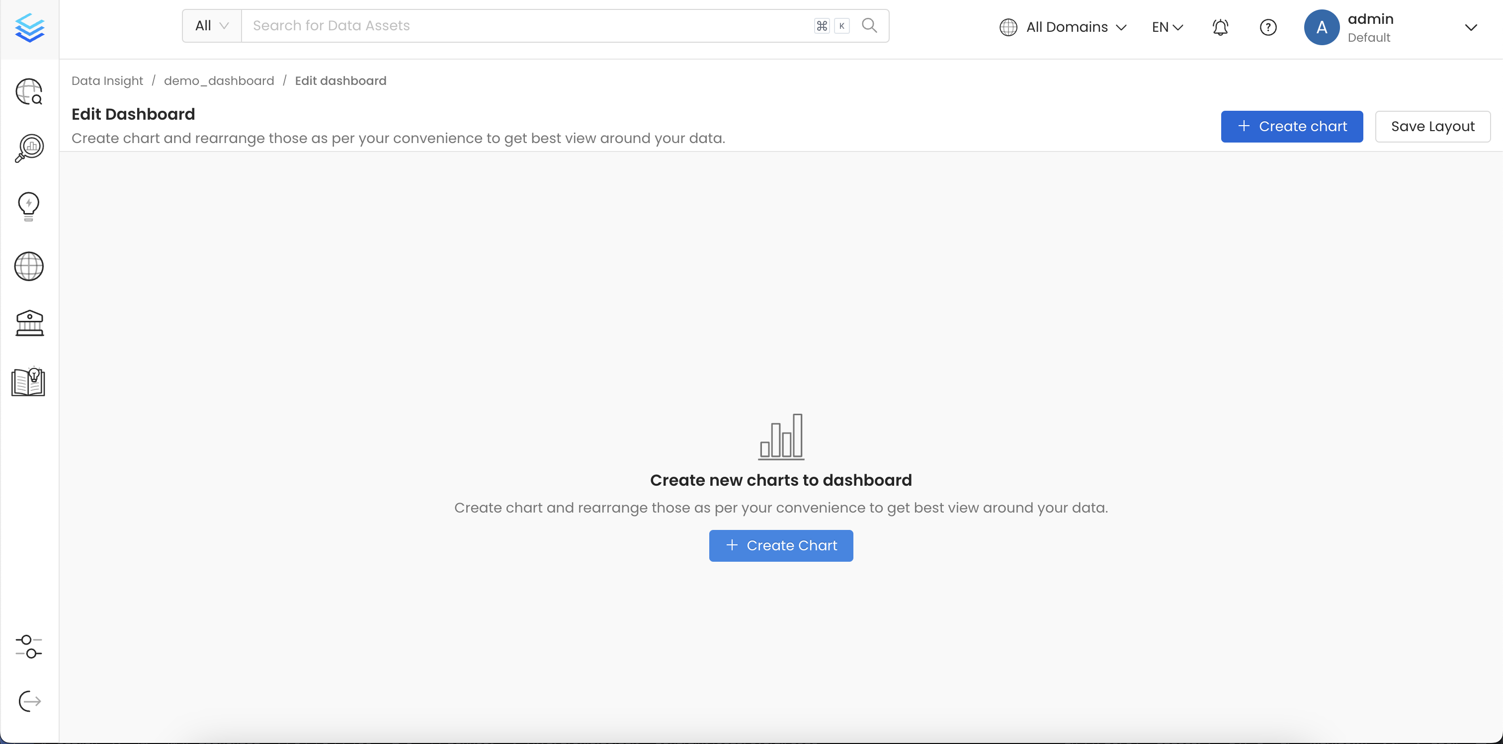
Once you create a dashboard, you can click onCreate Chart button to add a new chart to this dashboard
Table, Stored Procedure, Database Schema, Database, Chart, Dashboard, Dashboard Data Model, Pipeline, Topic, Container, Search Index, ML Model, Data Product, Glossary Term & Tag available within your Collate Instance.
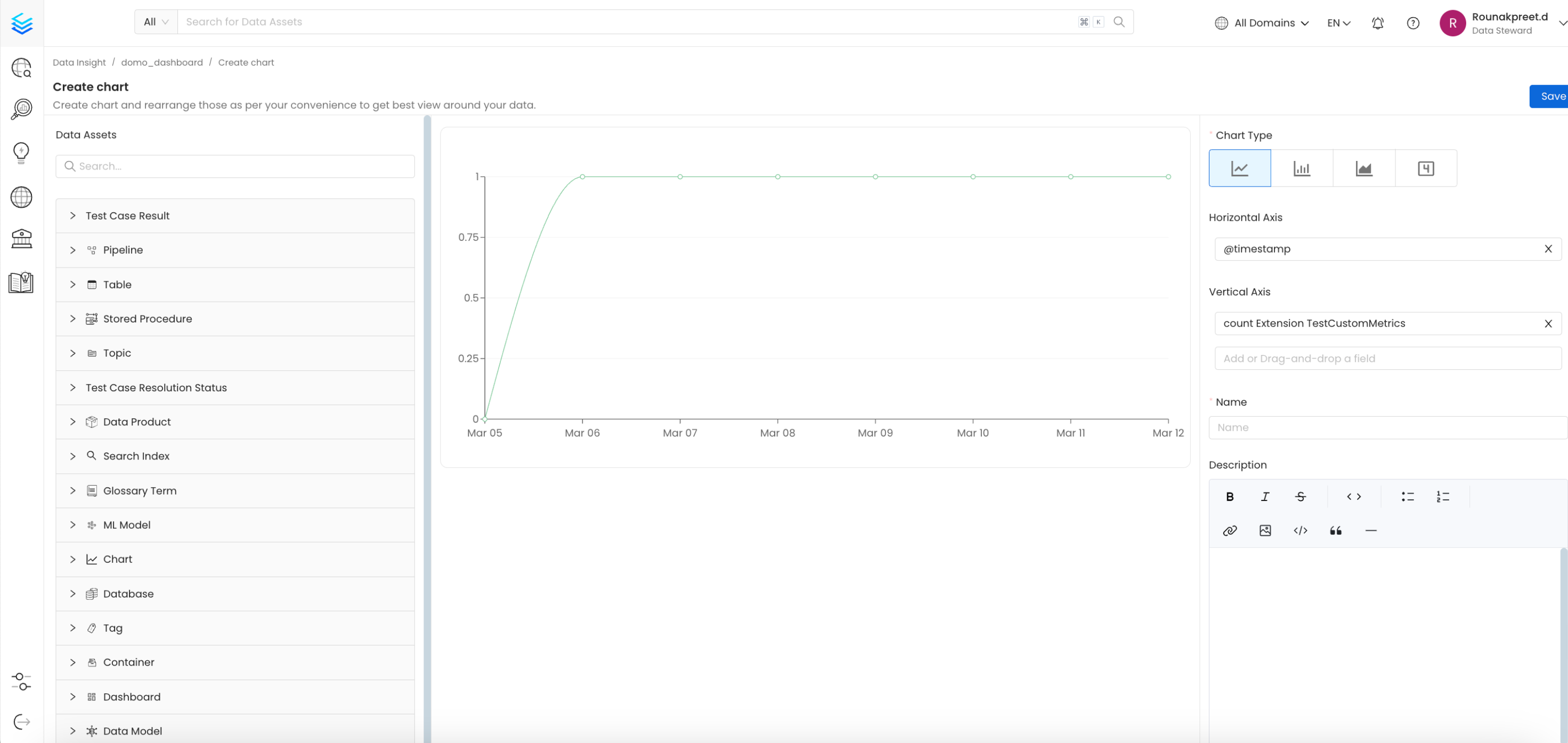
- Name: Provide a relevant name to the chart that we are about to create.
- Chart Type: You can create a
Line,Area,Barchart and aSummary Cardwhich is a special chart/card to represent a single value. - Description: Provide a details description to this chart so that it is easier to understand the output of the chart.
- GroupBy: Group by field is used to breakdown the results by a specific field, for example choose
entityTypeto breakdown the results by entity type. - Y Axis Label: Provide a custom label to y-axis.
- Advanced Filters: Filter down results by applying advanced filters, the experience of advanced filters is similar to the experience of explore page.
- Method: We support computation of chart based on 2 methods
Function&Formula.
Chart By Function:
-
Function: In this method you can choose the function from the dropdown menu of functions, the supported functions are
Count,Sum,Avg,Max&Min. Note: The functionsSum,Avg,Max&Minare only supported with field of numerical type, if you attempt to apply this function on any non numerical field then you will not see any output. -
Field: Select the filed from the given dropdown of list on which you want to apply the function, for example if you select function as
Countand field asidwhich is also the default selected option, then it will give you the count of records as described above. If you select function asAvgand field assizethen it will give you avg size of all the containers ingested in Collate, because only container entities hassizeas a field.
Chart By Formula:
- Formula: In case you want to write a custom logic to plot chart then chart by formula is the way to go. With formula you can write a complex mathematical expression including functions, fields and filters and the final result of this expression will get plotted on the chart.
count, sum, avg, min & max, and as explained above The functions Sum, Avg, Max & Min are only supported with field of numerical type, if you attempt to apply this function on any non numerical field then you will not see any output.
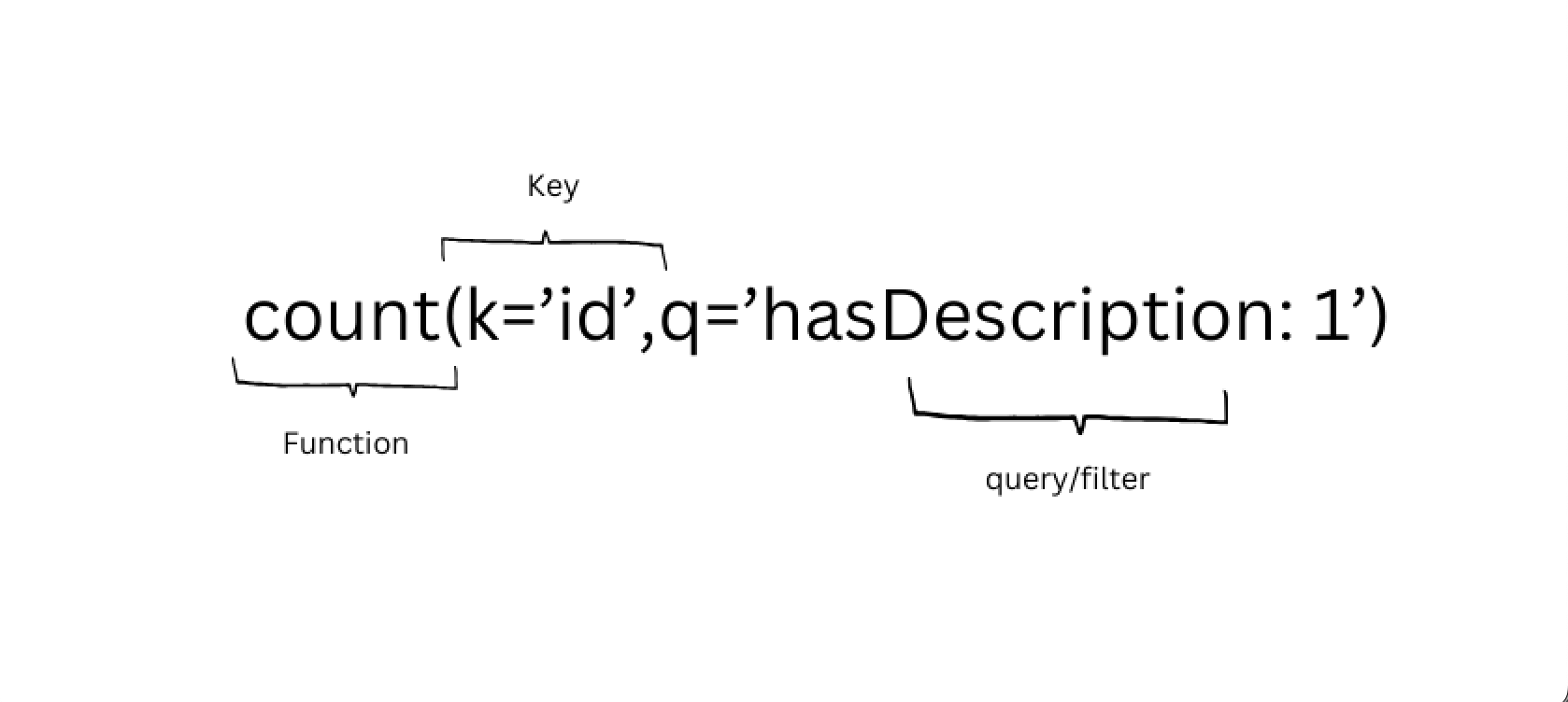
Key/Field: To define a key within a formula, use the format k='<field-name>'. The k= part indicates that you’re specifying a key field, and the field name goes inside single quotes.
You can choose the field name from the fields dropdown from the chart by function method. For example, if you want to use the Owner Name field, you would write k='owner.name' in the formula. If you want to use Owner DisplayName you would write k='owner.displayName'.
Remember, spaces in field names are replaced with a period (.), and the key should be in lower camel case (meaning the first word is lowercase, and each subsequent word starts with an uppercase letter).
Query: The query is to filter down the result to plot, use the format q='<filed-name>: <value>'. The q= part signifies a query, and the condition goes inside the single quotes.
The value can be a literal value or it can be * to signify that any value exists for the give field.
Examples:
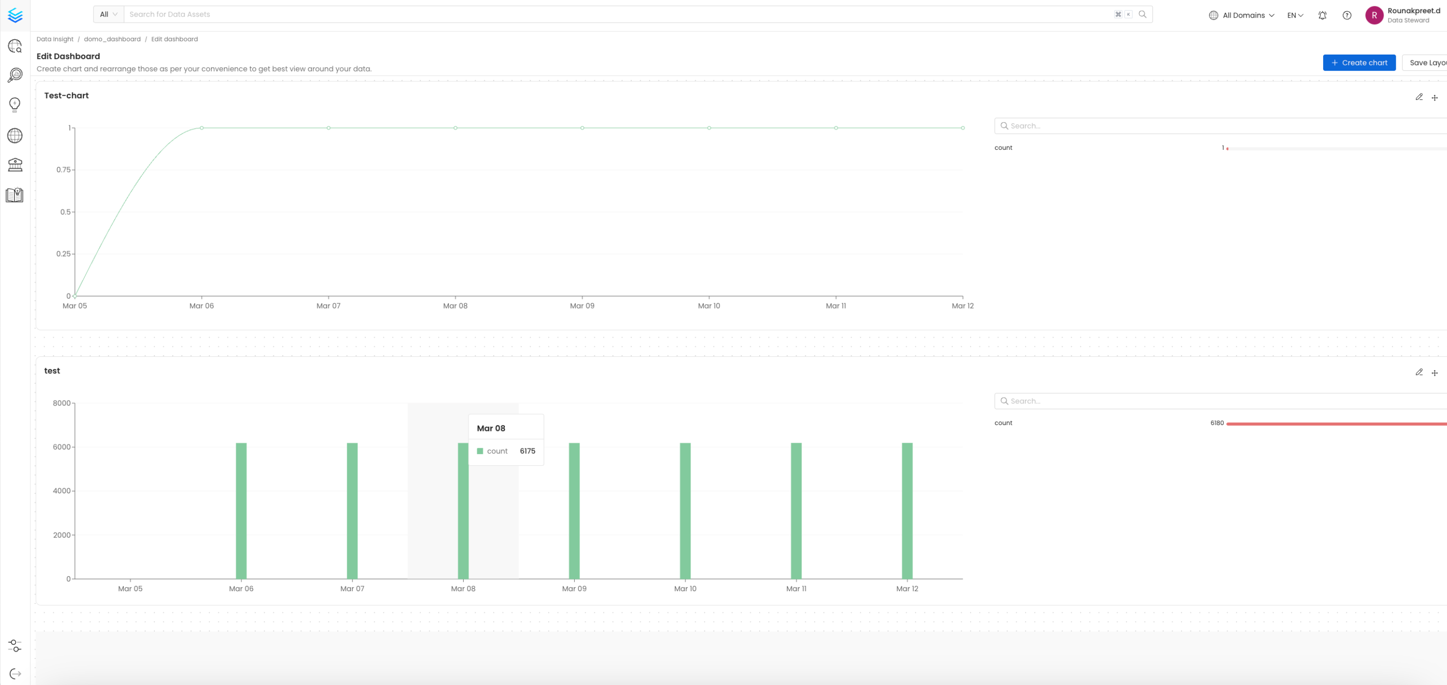
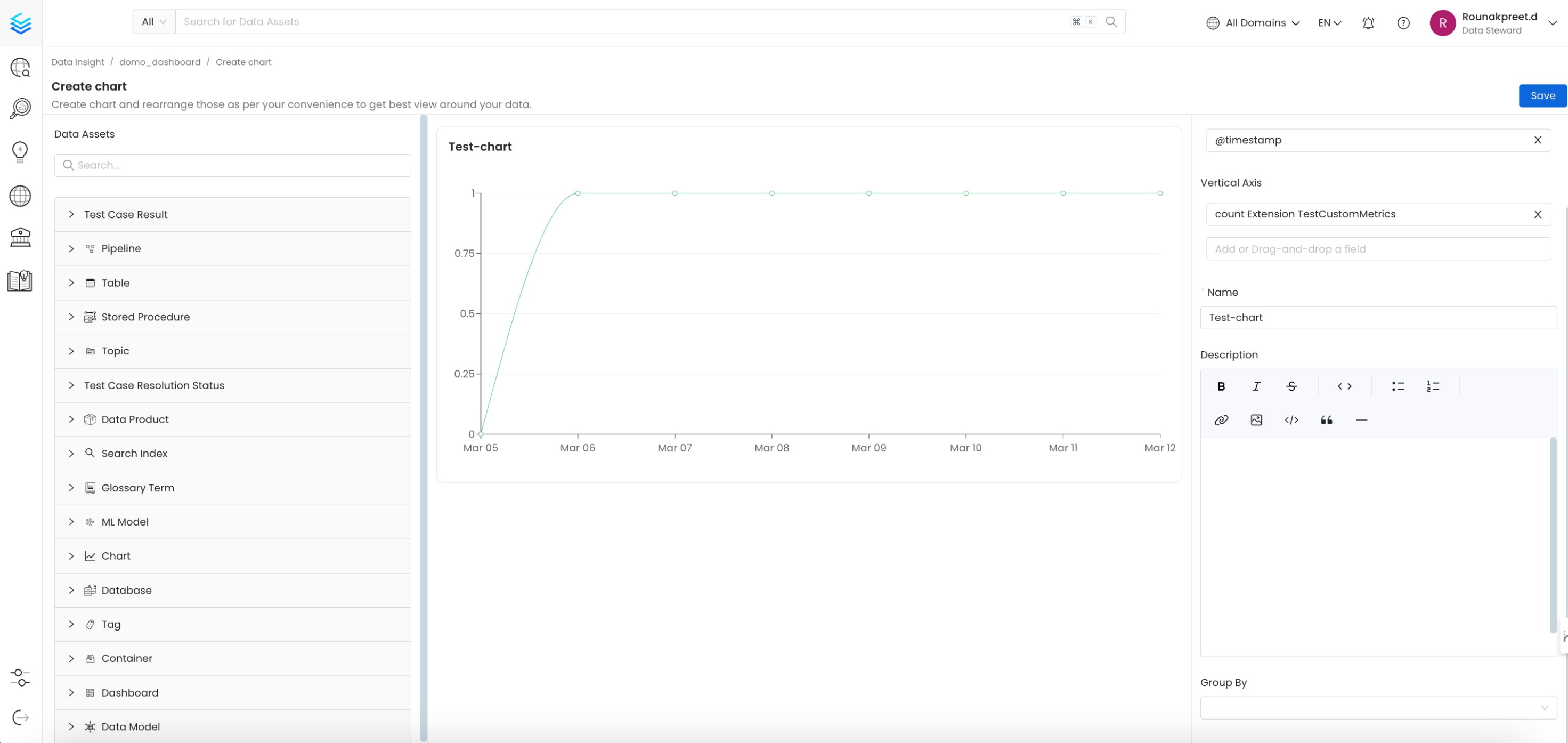
Step 3: Save the Chart and Layout
Once you have configured your chart correctly, click on the save button to save the chart and add it to dashboard.